Common Effects and Selection Bias
In the last post we looked at causal effects based on intermediate causes and common causes, both of which introduce a correlation that goes away when the “middle” variable is conditioned on. Now we’ll look at common effects which create correlations only when conditioned on.
For our first example, we’ll examine the relationship between SAT scores and high school GPA among college students. Suppose they have a latent “academic aptitude” variable for which SAT and GPA are imperfect measurements.
library(tidyr)
library(bnlearn)
library(ggplot2)
set.seed(52)
# We'll simulate more data points than we'll display, to facilitate
# causal inference later
nStudent <- 1000000
nDisplay <- 1000
# The latent aptitude variable looks like IQ with a mean of 100 and
# standard deviation of 15, and can be thought of as like IQ. But it
# isn't intended to represent the result of an actual IQ test.
apt <- rnorm(nStudent, 100, 15)
gpa <- apt/34 + rnorm(nStudent, 0, 0.3)
sat <- 11*apt + rnorm(nStudent, 0, 20)
df <- data.frame(apt, gpa, sat)If we plot SAT and GPA, we see a clear positive correlation. This is a spurious correlation created by the common cause of latent aptitude. The relationship isn’t causal in the sense that if one were to hack into the College Board and change their official SAT score, this would have no bearing on their GPA. The correlation is nonetheless interesting, especially considering the latent aptitude can’t be measured directly.
ggplot(df[1:nDisplay,], aes(gpa, sat)) +
  geom_point()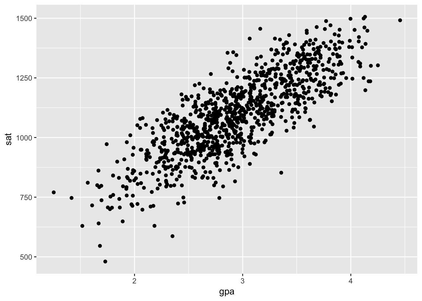
Now, let’s add a new variable representing which university each student is attending. We’ll use a simplified model for assigning students to unviversities. Universities evaluate applications by summing the percentiles of the SATs and GPAs, and admit a student if that amount is higher than some cutoff. There are nine universities, and each has their own cutoff. Students attend the most selective university they were admitted to. This cleanly seperates the students into distinct groups.
Each university studies the relationship between SAT and GPA for their own students. Let’s look at all of these studies on one plot.
# This creates a categorical variable that stratifies a continuous variable
# into discrete bins with equal probability. Contrast with the base function
# 'cut', which creates bins of equal length.
stratify <- function(vec, nStrats = 9) {
  return(factor(ceiling(nStrats*rank(vec)/length(vec))))
}
gpa.norm <- (gpa-mean(gpa))/sd(gpa)
sat.norm <- (sat-mean(sat))/sd(sat)
df$admit <- gpa.norm + sat.norm + rnorm(nStudent, 0, 0.05)
df$admit.strat <- stratify(df$admit)ggplot(df[1:nDisplay,], aes(gpa, sat)) +
geom_point(aes(color = admit.strat))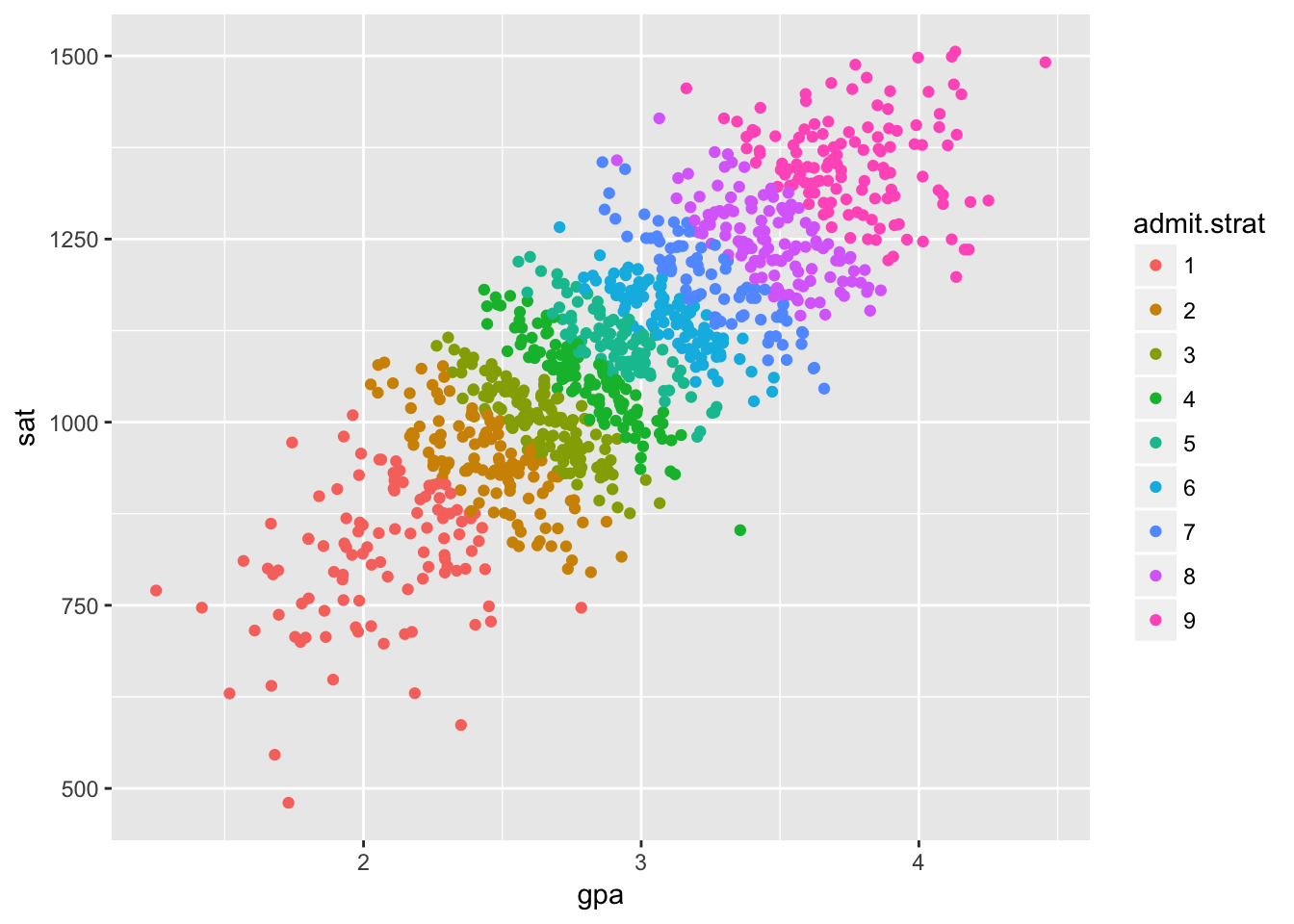
This is the same data as before, but we’ve colored the points based on which university a student attends. The overall correlation is positive, but within each university the correlation is negative except in the top and bottom schools. Interesting.
This is another type of spurious correlation commonly known as selection bias or Berkson’s paradox. The university a student attends is a common effect, which is a sort of inverse of a common cause in the effect it has on our analyses.
A common effect starts out without introducing any spurious correlation. That would clearly be impossible in our example, as GPA and SAT are determined in high school before any student applies to any colleges.
The spurious correlation only appears when we condition on the common effect. In our example, it would appear because weakness in one admission criteria can be compensated for by strength in the other criteria.
Mind that selection bias doesn’t have to flip the direction of correlation. We can get any direction of correlation we want and even different correlations in different groups by abritrarily partitioning our data with our common effect. Here’s some extreme examples, just for fun.
admit.l2 <- sqrt(gpa.norm^2+sat.norm^2) + rnorm(nStudent, 0, 0.1)
df$admit.l2.strat <- stratify(admit.l2)

ggplot(df[1:nDisplay,], aes(gpa, sat)) +
  geom_point(aes(color = admit.l2.strat))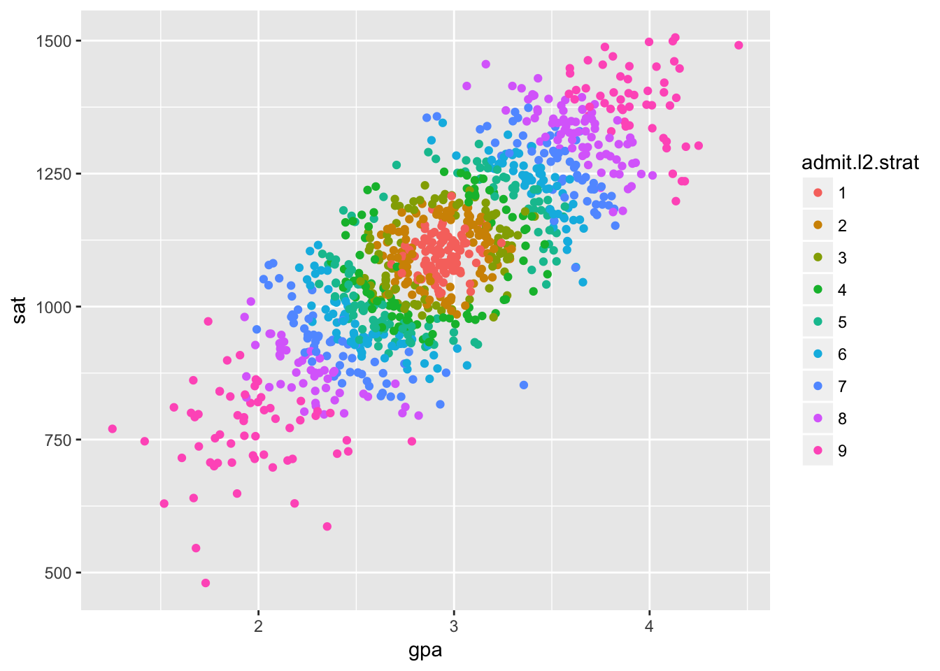
admit.cos <- 2*cos(3*gpa.norm)+sat.norm + rnorm(nStudent, 0, 0.1)
df$admit.cos.strat <- stratify(admit.cos)

ggplot(df[1:nDisplay,], aes(gpa, sat)) +
  geom_point(aes(color = admit.cos.strat))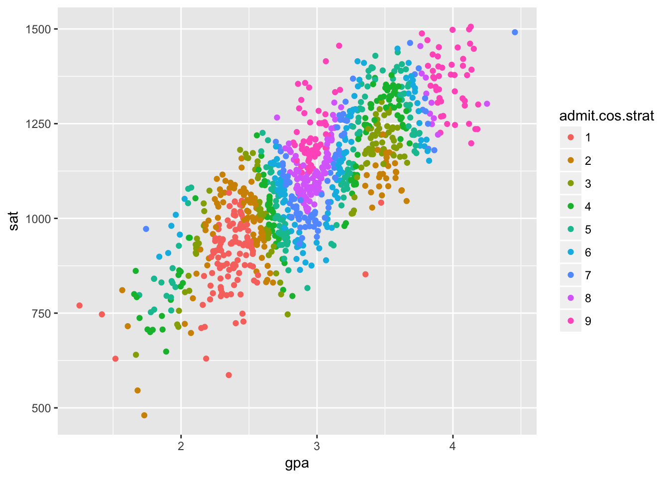
angles = 2*pi/5*(0:4)
mat <- cbind(cos(angles)+sin(angles), sin(angles)-cos(angles))
vars <- rbind(gpa.norm, sat.norm)
const <- matrix(c(1/2, 1/2, 1/2, 1/2, 1/2), 5, nStudent)
halfplaneIx <- as.numeric(mat %*% vars < const)
shifter <- matrix(0:4, 5, nStudent)
df$admit.partition <- factor(colSums(matrix(bitwShiftL(halfplaneIx, shifter), 5, nStudent)))

ggplot(df[1:nDisplay,], aes(gpa, sat)) +
  geom_point(aes(color = admit.partition))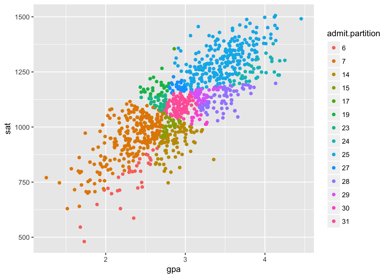
Learning causal structure with common effects
Among intermediate causes, common causes, and common effects, common effects are special. They have the opposite effect from the other two, obervationally.
If Z is a common cause or intermediate cause for X and Y: \[X \perp\!\!\not\!\perp Y\;and\; X \perp\!\!\!\perp Y\,|\,Z\] If Z is a common effect for X and Y: \[X \perp\!\!\!\perp Y\;and\; X \perp\!\!\not\!\perp Y\,|\,Z\]
It’s for exactly this reason that we can distinguish them from data with gs.
result = gs(df[,c('apt', 'gpa', 'admit', 'sat')])
plot(result)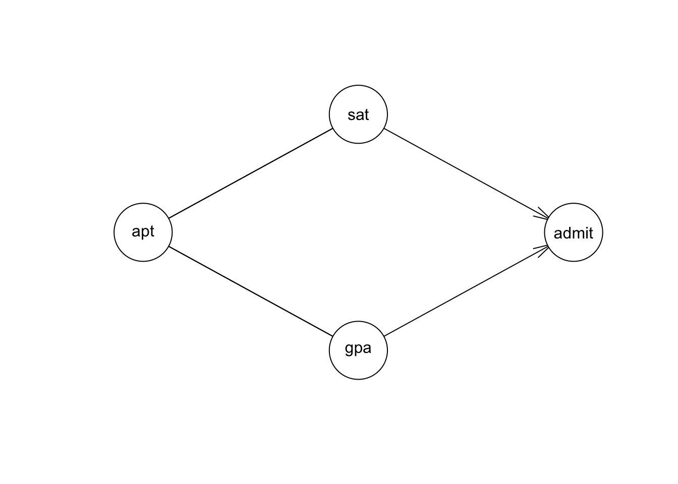
These dependencies and conditional dependencies are determined by gs with linear regression, as usual.
Inheritance of height
We’ll work through a subtler example too. This uses simulated data with parameters taken from a study1 on inheritance of height in humans. X represents the father’s height, Y represents the mother’s height, and Z represents their child’s height in adulthood.
mdl.height <- model2network('[X][Y][Z|X:Y]')
X.dist <- list(coef = c('(Intercept)' = 67.68), sd = 2.7)
Y.dist <- list(coef = c('(Intercept)' = 62.48), sd = 2.39)
Z.dist <- list(coef = c('(Intercept)' = 14.08, X = 0.409, Y = 0.430), sd = 2.7)
fit.height <- custom.fit(mdl.height, list(X = X.dist, Y = Y.dist, Z = Z.dist))
set.seed(200)
n <- 10000
#
df.XYZ <- rbn(fit.height, n)The father and mother’s heights are initially uncorrelated, with a small and statistically insignificant regression coefficient.
summary(lm(Y ~ X, df.XYZ))##
## Call:
## lm(formula = Y ~ X, data = df.XYZ)
##
## Residuals:
## Min 1Q Median 3Q Max
## -8.6039 -1.5605 -0.0068 1.6012 9.2959
##
## Coefficients:
## Estimate Std. Error t value Pr(>|t|)
## (Intercept) 63.178924 0.602809 104.8 <2e-16 ***
## X -0.010682 0.008901 -1.2 0.23
## ---
## Signif. codes: 0 '***' 0.001 '**' 0.01 '*' 0.05 '.' 0.1 ' ' 1
##
## Residual standard error: 2.388 on 9998 degrees of freedom
## Multiple R-squared: 0.000144, Adjusted R-squared: 4.404e-05
## F-statistic: 1.44 on 1 and 9998 DF, p-value: 0.2301However the father and mother’s heights are correlated when adjusting for the child’s height, with a slightly larger but definitely statistically significant regression coefficient.
summary(lm(Y ~ X + Z, df.XYZ))##
## Call:
## lm(formula = Y ~ X + Z, data = df.XYZ)
##
## Residuals:
## Min 1Q Median 3Q Max
## -8.3351 -1.4928 0.0064 1.5213 8.3838
##
## Coefficients:
## Estimate Std. Error t value Pr(>|t|)
## (Intercept) 51.128395 0.649976 78.66 <2e-16 ***
## X -0.124081 0.008870 -13.99 <2e-16 ***
## Z 0.287647 0.007687 37.42 <2e-16 ***
## ---
## Signif. codes: 0 '***' 0.001 '**' 0.01 '*' 0.05 '.' 0.1 ' ' 1
##
## Residual standard error: 2.236 on 9997 degrees of freedom
## Multiple R-squared: 0.123, Adjusted R-squared: 0.1228
## F-statistic: 701 on 2 and 9997 DF, p-value: < 2.2e-16Adding variables to a regression never hurts predictive accuracy (at least in the given training data, neglecting overfitting). However, it can bias measurement of the true causal effect as illustrated by this effect.
Next, we’ll review methods of accurately measuring the magnitude of causal effects from observational data.
Clemons, Traci. “A look at the inheritance of height using regression toward the mean.” Human biology (2000): 447-454.↩